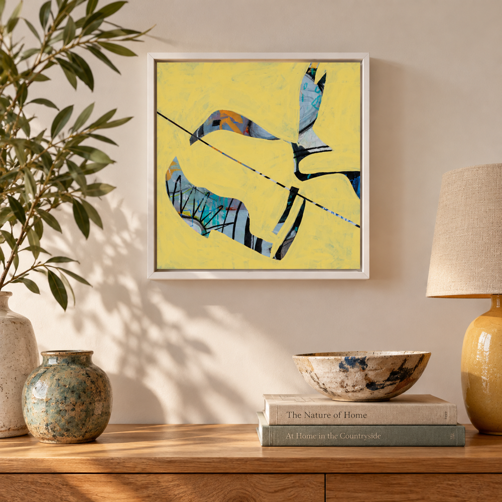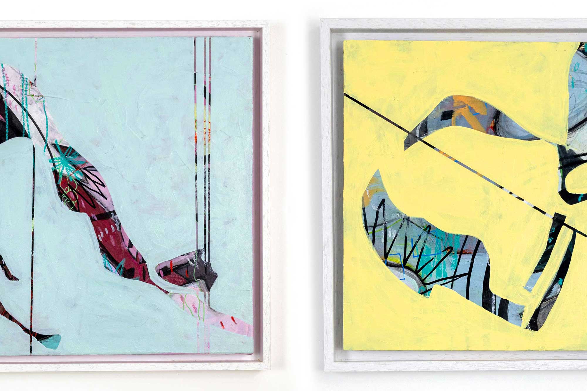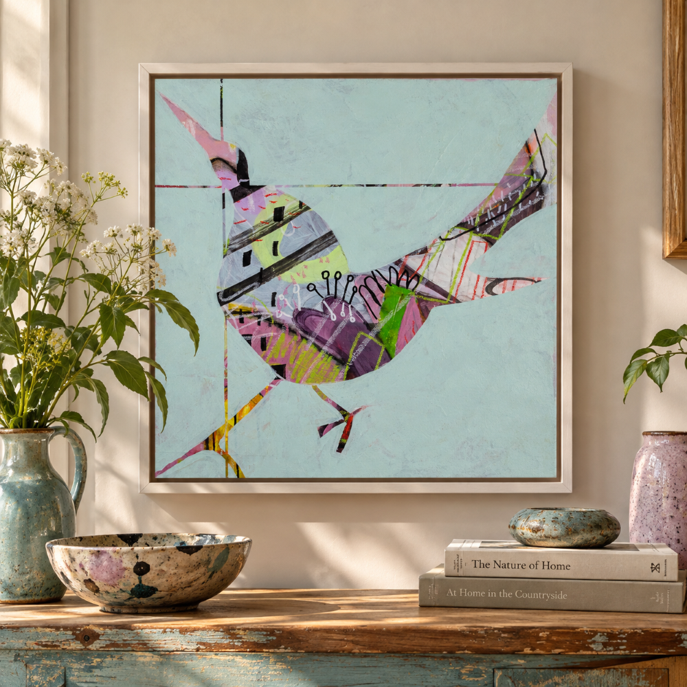
Some people have a favourite colour already, or a place they love that’s full of colour so choosing work can be easier, but choosing artwork by mood and feeling begins with colour.
Choosing artwork for your home isn’t just about finding colours that go with your walls, sofa or favourite rug. It’s also about how you want to feel when you’re in the room.
Perhaps you want something that gives you a little lift as you head out for the day. Something calming to look at when you finally get into bed. A splash of colour that makes your living room feel warm and welcoming when friends come round. Or a piece that makes you stop for a moment, notice something unexpected and forget about your to-do list.
Colour can play a big part in that feeling. But it’s not the whole story. The shapes, marks, subject and character of a piece of art can matter just as much.
So, if you’re wondering how to choose art by colour, here’s a thought: rather than starting with the room, start with how you want to feel in it.
What do you want your artwork to do for you?
We spend a lot of time thinking about how our homes look. But how they make us feel matters too.
Artwork is one way to change the atmosphere of a room without redecorating from top to bottom. It can bring energy to a quiet corner, add warmth to a neutral space or give your eyes somewhere interesting to rest.
Energy to start the day
A lively mix of colours, strong contrasts or shapes that seem to move can bring a sense of momentum to a hallway or the space you pass through on your way out. You might be drawn to bright yellows, punchy reds or blues that have a real zing to them. Or perhaps it’s the rhythm of the marks and shapes that gives a piece its energy.
Somewhere to unwind
Softer colours, gentle contrasts and more spacious compositions can feel restful. Blues, greens and muted tones might appeal, particularly if you enjoy the feeling of being near water or surrounded by trees. But a quiet, thoughtful piece doesn’t have to be pale or neutral. Sometimes a deeper colour or a familiar shape can have a wonderfully grounding effect.
Warm and welcoming
Rich colours, earthy tones, playful images or artwork with a sense of humour can give a room personality. Perhaps you want visitors to feel at home, or you’d like your living room to feel like a place where people can settle in, talk and stay a little longer.
Unmistakably you
Perhaps you love unusual shapes, bold colour combinations or things that make you smile. Maybe you prefer work that is a little strange, a little mysterious or difficult to pin down. Your home doesn’t need to look like anyone else’s. The artwork you choose can reflect the things you’re curious about, the things you love and the way you see the world.
There isn’t a right answer here. The point is to think about the feeling you’re looking for before worrying about which colour is supposed to create it.glass), labour (cutting, mounting, assembly), and expertise (especially if it’s conservation framing).
Choosing art by colour: there are no fixed rules
Colour is often associated with particular moods. Blues and greens are frequently linked with calm, yellows with optimism, reds with energy and earthy colours with warmth.
These associations can be useful starting points, but they’re not rules.
A bright blue painting might feel exhilarating to one person and peaceful to another. A red artwork might feel warm and comforting, or dramatic and restless. Much depends on the particular shade, the colours alongside it, the image itself and your own associations.
Think about what colours mean to you.
Does blue remind you of a favourite place, a clear winter sky or the sea? Does green bring back memories of walking through woodland? Does a particular shade of orange make you think of autumn leaves, a favourite piece of clothing or the glow of evening light?
These personal connections can be more meaningful than following a colour scheme.
And remember, colour isn’t just about the main colour in a painting. A small flash of yellow against blue, a line of orange through green or an unexpected patch of pink can completely change the feeling of a piece.
Sometimes it’s the colour you almost don’t notice at first that keeps drawing you back.
Let your existing room help, but don’t let it dictate your choice
If you already have a room you love, look at the colours that are there. Your walls, furniture, textiles and natural materials can all be useful clues when choosing artwork.
There are three simple ways to approach it.
- Echo a colour that’s already there.
- Pick out a shade from your rug, cushions, curtains or furniture. Artwork that repeats a colour already in the room can help the different elements feel connected, even if the subject and style are quite different.
- Introduce a contrasting colour.
Sometimes a room needs a little tension rather than more of the same. A contrasting colour can give the eye somewhere to go and help artwork stand out. Blue against warm orange tones, for example, can create a very different effect from blue against pale grey.
Bring in something completely unexpected.
This is where things can get interesting. A room doesn’t have to be a perfectly coordinated collection of colours. A piece of artwork can introduce a new shade, an unusual combination or a subject that wouldn’t have been your obvious choice.
It might be the one thing that makes the room feel individual rather than simply well decorated.
If you find yourself drawn to a piece that doesn’t match anything you own, don’t dismiss it straight away. Ask yourself whether it might be exactly what the room is missing.
What about blue artwork?
Blue is a good example of why choosing art by colour is about more than matching shades.
Blue can feel open and airy, deep and contemplative, playful or full of energy. Pale blues can sit beautifully against warm whites and natural wood, while stronger blues can bring definition to a neutral room. Blue artwork can also work against blue walls, creating a tonal arrangement rather than a contrast.
You don’t have to decorate in blue to enjoy blue art, either. A blue painting can introduce a cool note into a room filled with warm colours, or offer a moment of visual quiet in a busy interior.
And the painting itself matters. A blue artwork filled with movement and expressive marks will have a different character from one with soft, flowing shapes or a small, intriguing subject.
If you’re drawn to blue, look beyond the shade. Think about the image, its energy and the feeling you get when you spend time looking at it.
[Explore blue artwork] to find pieces that might suit your home.
Colour isn’t the only thing that makes you feel something
Have you ever looked at an image and felt drawn to it before you could explain why?
It might be a shape that reminds you of something familiar. A creature you can almost recognise. A pattern that keeps changing as you look at it. Or a few marks that somehow suggest movement, a place or a memory.
These responses are part of what makes choosing original art so personal.
The subject, shapes, textures and way an artist has made a piece all contribute to its character. Even an artwork with a limited palette can be full of life. And something colourful isn’t necessarily lively. It might be gentle, thoughtful or quietly strange.
Perhaps you want a piece that gives you something new to notice each time you pass it. Perhaps you want something that makes you smile without needing to explain why. Or perhaps you’re drawn to work that helps you slow down for a moment in a world that rarely stops asking for your attention.
You don’t have to be able to put that feeling into words. You just have to recognise it when it happens.
Choose artwork you’ll enjoy living with
It’s easy to get caught up in whether an artwork is the right colour, the right size or the right style for a particular room. Those things matter, of course. But they’re only part of the decision.
Try this simple exercise when you’re looking for artwork.
- Think about the room where you’d like to put it. How do you want to feel when you’re there?
- Notice the colours you already have, but stay open to something different.
- Look at the artwork itself. What catches your eye? The colour, the subject, the shapes, the marks or something you can’t quite explain?
- Imagine seeing it every day. Does it still interest you? Does it make you feel something, however small?
- Check the practical details, including the dimensions, framing and where it will hang.
You don’t need to find a piece that ticks every box. Sometimes the artwork that feels right is the one that makes you reconsider what you thought you were looking for.
Find artwork that feels right for you
I think the best thing about choosing art for your home is that there isn’t a formula to follow.
You can choose something that picks up the colour of your favourite cushion, or something that clashes with everything else in the room. You can choose a quiet image that helps you pause, a lively piece that lifts your spirits, or something unusual that makes you look twice.
The important thing is that it gives you something you want to live with.
My own work begins in different ways with different formulas, from close observation of everyday things to questions, ideas and unexpected connections. I work across drawing, painting, printmaking and sculpture, following ideas through different materials and seeing where they lead.
If you’re curious, have a look around and see what catches your eye. You might find a piece that fits a space you’ve been thinking about, or you might discover something you hadn’t realised you were looking for.
Questions about colour? Email me